Dapper.net & Tutorial Video at http://www.dapper.net/dapperDemo/
On Information Design
- Who are the users? The users for the tutorial are advanced web authors to provide an brief overview of the dapper tool. Users must know the definition and uses for terms such as RSS and XML. Users are also assumed to have a working knowledge of YouTube and how to search for a video using the site.
- Information chunk (gestalt principle, amount information). The information is chunked in a roughly 5 minute module. Because of the short time for instruction, the author has provided information for a fairly specific audience. Entry knowledge is assumed and the instruction only shows a brief simple example highlighting the main features of the tool. The video simply familiarizes the user with the dapper interface.
- Relevance (graphics, content, reading level, text). The video was a screen capture narrated with a voice over. The screen was sized down to allow it to be displayed within the content area in the Dapper template. This made the text hard to read at times but still gave you an idea of how to navigate the site. The graphics were the exact graphics that a user of the dapper site would encounter. This
- Labeling (visual with text). The video had standard controls at the top of the video. It had a distinguishable color contrast from the video so that the controls could easily be located. The "next Demo" link looked like it could have been part of the screen capture and it did not stand out visually. I think that the first time I watched this video I actually thought that there were no additional tutorials and was disappointed.
- Consistency (visual, text). The video was a screen capture of the Dapper site so there was no difference from the video example to actually using the site.
- Detail (too much on one page or one screen). The short 5 minute module was a tolerable length for new users. There are more tutu rials available for those users that are interested in more examples.
On Interactivity
- Orientation (Can you find the path, and know your way around?) The introduction tutorial link is located on the homepage right under the search feature. On the video page the video controls are easy to find.
- Navigation (Branching) The navigation for additional videos is not easily distinguishable from the screen capture.
- Functionality (Does it work?) The video played with ease and did not require any additional browser plug-ins for me.
- Information access (Multiple entry and exit? Logical path?) There are multiple ways to navigate to the video tutorial. One link is located under the main search feature on the homepage. There is another link under a heading for "New to Dapper". Additionally, there is a link in the footer under the "Help" heading. This tutorial should be easily located for multiple users scanning the homepage for 3 separate logical headings.
On Screen Design
- Attractive (first impression). The Dapper site design is simple, clean, and inviting. I was particularly attracted to the Dapper logo.
- Resolution. The Dapper site does not use an abundance of graphics which helps readability. So the colored/shaded boxes do not require a high resolution to be viewed as intended.
- Color. I like the blue color theme. I think that it models after yahoo.com's color theme which is one of the highest volume sites by visitors.
- Lay out. The layout is atypical for me. I am used to seeing navigation at the top of the screen. However Dapper utilizes a large logo and search feature as the majority of the top of the homepage. The navigation is then dispersed in the footer in a light gray. This makes it harder to find, but i think that this was intentional by the designers. The search is going to be used primarily by new users and users who are looking to determine what Dapper is. This layout makes the likelihood of users to search the dapper applications.
- Readability. The dapper pages are very easy to read. The text background contrast is high enough to make everything very readable. However, the video tutorial uses a minimized screen and makes the text too small to read at times. The video also has no way to zoom in on the text if a user can not read the text which can cause frustration and inhibit learning.
Monday, November 17, 2008
Thursday, November 13, 2008
Everyday Thing - Toilet Paper Role
Toilet Paper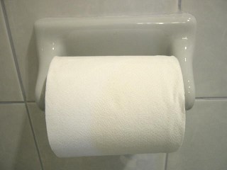
We all use toilet paper(well at least I hope so) but how well is it designed? Prior to this assignment I do not think that I would have ever pondered this question, however, once I began to think about my countless encounters with this everyday thing, I was thinking yes...and then no...and then yes.
Toilet paper was designed for functionality and I think that it certainly serves its purpose. TP is soft - little irritation, flushable - maintains cleanliness, perforated - able to serve for light and heavy messes, and white - visible displays staining.
Lets get into more specifics:
Affordance - When toilet paper is on a role the white color and light perforations do not clearly signal to the user where the beginning of the role is. Countless times I have reached for a toilet paper role and spun the role in both directions in hopes the starting square would reveal itself. Still with no apparent starting square, I spin harder in my frustration again in both directions only to result in miles of toilet paper on the bathroom floor. And im never thrilled about rolling bathroom floor TP back onto the role, eww.
Though, the perforations afford for ease of tearing. Just a little tug and most times the TP separates near that role.
Constraints:
Toilet paper comes in a role. So the toilet paper wall mount was designed to hold and dispense the toilet paper. The role constrains the design of the wall mount. It must allow for easy spinning of the role to release paper. However, to prevent the role from falling off of the mount it must be constrained on both sides of the role. So far so good, but what happens when you want to remove the empty role?

The double bound wall mount calls for a spring held rod to hold the role. To remove the role you must push in one side of the rod to push in the spring and then pull out the empty role. This was extremely challenging for me as a child. In fact, I have had several roommates who must be so frustrated with this design that they never replace a tp role!
Mapping/Visibility
The wall mount rod does not have any visual cues to let the user know how to remove a role. Due to the design constraints the spring loaded rod is concealed by the tp role that it holds which limits the space able to provide visual cues. This hurts the mapping of the design as well. With a concealed part that must be manipulated to remove the role it is hard for a first time user to determine the relationship between the role and the rod.
Ok I could write about this incredibly useful everyday thing all night but alas it is time for class.
Is this design good or bad for you? Or is the real question, is the design flawed enough to go back to diapers?
We all use toilet paper(well at least I hope so) but how well is it designed? Prior to this assignment I do not think that I would have ever pondered this question, however, once I began to think about my countless encounters with this everyday thing, I was thinking yes...and then no...and then yes.
Toilet paper was designed for functionality and I think that it certainly serves its purpose. TP is soft - little irritation, flushable - maintains cleanliness, perforated - able to serve for light and heavy messes, and white - visible displays staining.
Lets get into more specifics:
Affordance - When toilet paper is on a role the white color and light perforations do not clearly signal to the user where the beginning of the role is. Countless times I have reached for a toilet paper role and spun the role in both directions in hopes the starting square would reveal itself. Still with no apparent starting square, I spin harder in my frustration again in both directions only to result in miles of toilet paper on the bathroom floor. And im never thrilled about rolling bathroom floor TP back onto the role, eww.
Though, the perforations afford for ease of tearing. Just a little tug and most times the TP separates near that role.
Constraints:
Toilet paper comes in a role. So the toilet paper wall mount was designed to hold and dispense the toilet paper. The role constrains the design of the wall mount. It must allow for easy spinning of the role to release paper. However, to prevent the role from falling off of the mount it must be constrained on both sides of the role. So far so good, but what happens when you want to remove the empty role?
The double bound wall mount calls for a spring held rod to hold the role. To remove the role you must push in one side of the rod to push in the spring and then pull out the empty role. This was extremely challenging for me as a child. In fact, I have had several roommates who must be so frustrated with this design that they never replace a tp role!
Mapping/Visibility
The wall mount rod does not have any visual cues to let the user know how to remove a role. Due to the design constraints the spring loaded rod is concealed by the tp role that it holds which limits the space able to provide visual cues. This hurts the mapping of the design as well. With a concealed part that must be manipulated to remove the role it is hard for a first time user to determine the relationship between the role and the rod.
Ok I could write about this incredibly useful everyday thing all night but alas it is time for class.
Is this design good or bad for you? Or is the real question, is the design flawed enough to go back to diapers?
Friday, November 7, 2008
Empathy Presentation - Blog Version
Well the blog version is exactly the same. Last night I tried walking in a 2 year olds shoes to try to feel what it was like to be a baby. Well let me tell you it is confining and painful. I only lasted about 2 minutes before my feet turned purple and gangreny!
Friday, October 24, 2008
Eugene Lee's & SocialText - Forgotten Post
Oops, I guess that I forgot to publish this one and instead saved it as a draft.
Monday, October 20, 2008

Sunday, October 19, 2008
Mashups: Web Application Hybrid
Mashups:Web Application Hybrid
Here is my Slide Show
Or... you can see the text version of the presentation.
What is a Mashup?


How to Make a Mashup
APIs = Computer Science
Mashup Editors
Slide 9
Dapper
Popfly
Ubiquity for Firefox
Ubiquity for Firefox from Aza Raskin on Vimeo.
Mashups in Education

Could allow you access to our class Ning site from iLearn!

Here is my Slide Show

Or... you can see the text version of the presentation.
What is a Mashup?
- A web application that combines data from more than one source into a single integrated tool thereby creating a new and distinct web service that was not originally provided by either source.

How to Make a Mashup
- Mashed content is typically gathered from other sites through an API(application programming interface)
- API’s make it possible to use programs from within programs
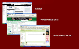
- Ex. iGoogle, iGoogle gadgets, Google Docs, Windows Live, Yahoo Mail (think multi function programs on a webpage with out needing to re fresh the page)

APIs = Computer Science
- APIs require coding like:
- .NET
- Java
- JavaScript
- PHP
- Python
- An API can require knowledge of all of these coding languages
- Content can also be gathered by Web Feeds(RSS, ATOM) and Screen Scraping


Mashup Editors
- Mashup Editors: are WYSIWYGs for mashups. They provide a visual interface to build a mashup, often allowing the user to drag and drop data points into a web application.
n
- Orchestr8 AlchemyPoint
- WSO2 Mashup Server
- Microsoft Popfly
- Yahoo! Pipes
- QEDWiki by IBM
- Google Mashup Editor
- Serena Business Mashups
- Dapper
- Openkapow
- JackBe
- LiquidApps
- Open Mashups
- WaveMaker Ajax Studio

Dapper

Popfly

Ubiquity for Firefox
Ubiquity for Firefox from Aza Raskin on Vimeo.
Mashups in Education
- Stop New Nukes
An education/advocacy project to make folks aware of the impact of nuclear weapons. Combines Google Maps with Flickr photos of various nuclear hazards.
- The Globe is Warming
If you’ve ever wondered what m ight happen to the coastal areas given the future impact of climate induced sea level rise (and who hasn’t?), then this apocalyptic before & after mashup is for you.
- CampusExplorer
Search through 6,000 US universities by location, field of study or degree type. Results include a Google Maps view with plotted locations for each campus.

Could allow you access to our class Ning site from iLearn!

Thursday, October 9, 2008
Reflections - Oct 3 - Eluminate
Every semester I have a class that is conducted through Eluminate. I appreciate each Eluminate class for the experience, but I really do not like them. I find them very hard to maintain focused on the class lecture/discussion. There always seem to be many audio/video problems that come up and really disrupt the flow of the class. I have not participated in a class via Eluminate as the sole online participant but it seems that Josh has an easier time moderating single users to 10+. I just do not see myself opting to participate on Eluminate unless I had no option but to miss class. Also, as an instructor I would not choose to use Eluminate unless I had a TA who could dedicate their time to managing it. It would be impossible for Kim to facilitate the students in class as well as on Eluminate. Really, Eluminate has a long way to come in usability for me to see it as a truely usefull tool. It is a great start though.
One of my favorite peer blog phrases from this class was, "although I got a flavor for the lecture, I really did miss out on being a participant." I think that really captures my experience with Eluminate as an online user.
One of my favorite peer blog phrases from this class was, "although I got a flavor for the lecture, I really did miss out on being a participant." I think that really captures my experience with Eluminate as an online user.
Subscribe to:
Posts (Atom)